News:
Brokerage
Posted: February 23, 2015
MADGI and Studio aCd Architetti complete 15,000 s/f U.S. headquarters and showroom for Lavazza
The New York City architecture, design, and planning firm of Montroy Andersen DeMarco (MADGI) and the Turin, Italy-based studio aCd architetti have completed the U.S. headquarters office and showroom of the leading global coffee supplier and equipment manufacturer Lavazza, also based in Turin.
Located at 120 Wall St. in th lower section of the borough, the 15,000 s/f office occupies the entire 27th floor of the building. MADGI's office collaborated with the Italian design team to introduce Lavazza's global branding standards into an American office environment.
"Our project team took Lavazza's material and design concepts, developed in Italy by our colleagues at studio aCd architetti, and then executed these ideas to create a European-flavored, but very American, high-energy office with open work spaces, glazed meeting rooms, and breathtaking views of Manhattan and the surrounding waterways," said MADGI principal Steven Andersen.
MADGI assisted Lavazza during the preliminary planning phase and helped the client identify and select the space suitable for its functional, spacial, and branding needs. The newly leased, full-floor space at 120 Wall Street features a 1,000-sq.-ft wrap-around outdoor terrace that takes advantage of the views of the Hudson River and Manhattan. The irregular-shaped floor plan of the office encompasses the central elevator core with a private elevator landing.
The design goals included creating a striking showroom space that would be appealing to American customers while following Lavazza's global branding, signage, and finishes standards.
The interior program includes a 700 s/f showroom in the southeast corner of the space, a 400 s/f main conference room adjacent to the showroom, a 200 s/f meeting room, two 350 s/f executive offices, a reception area that incorporates a lounge section and an adjacent 200 s/f cafeteria, and an open workstation area. The office houses approximately 35 employees.
The showroom, designed to emulate an almost home-like atmosphere, features white display cases for coffee-making equipment, books, and promotional items; a hardwood floor in contrasting natural wood and dark "espresso" stain colors; two narrow, white countertops that serve as meeting and display tables with bar-type stools in white and red; strip LED lighting imbedded in the drywall ceiling; and expansive windows.
The conference room, intended mainly for client meetings, features a movable partition with etched branded patterns that opens into the showroom and a large, three-dimensional, wooden cut-out Lavazza logo relief. The espresso-stained hardwood floor features a lighter, naturally-colored perimeter border. The furnishings include an oval light wood and glass table and white leather chairs.
In contrast to the residential-like design of the showroom, the reception area features strong corporate branding, contrasting colors, mixed natural and artificial materials, and partially exposed ceilings and infrastructure, all of which is painted white. The 12-ft.-long, curved reception desk was manufactured using red-lacquered wood above a brushed steel base, with a horizontal LED light stripe that follows the curvature of the desk. The rare section of the reception desk is fabricated from natural wood. The back wall of the receptionist's station features panels in alternating red and burgundy colors. The flooring is natural-colored hardwood. This section also includes contrasting white and red walls and a large, three-dimensional Lavazza "coffee cup" logo feature that faces the elevator door.
One of the unusual interior elements of the reception area is the Topakustik ceiling system by Fantoni Group. Topakustik features panels of sound absorbent wood strips designed for aesthetic and sound effect. The back of the panel is made of a layer of sound absorbent material. The reception includes 1,130 sq. ft. of Topakustik panels. The area also features 710 sq. ft. of the Ecophon Solo ceiling system. The unframed panels, manufactured by Saint-Gobain, add architectural variety to the space. Both ceiling elements are painted white to contrast with the strong colors of the reception desk and the three-dimensional logo feature.
A long storage wall installed along the building core runs throughout most of the length of the space. The elevator doors feature frames painted with leather-like paint.
Open workstations by UNIFOR are separated into nine clusters with full-height divider walls covered with brand-related graphics, creating semi-private workspace environments. Glass panel walls with etched graphics surround the clusters.
Tags:
Brokerage
MORE FROM Brokerage
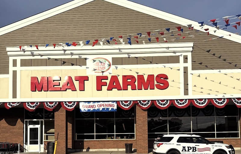
Delisle and Monahan of Island Associates lease 45,000 s/f to Giunta’s Meat Farms at Strathmore Commons
Middle Island, NY Roger Delisle and Robert Monahan of Island Associates negotiated the lease for the Giunta’s Meat Farms to occupy 45,000 s/f at Strathmore Commons.

Quick Hits
Columns and Thought Leadership

Behind the post: Why reels, stories, and shorts work for CRE (and how to use them) - by Kimberly Zar Bloorian
Let’s be real: if you’re still only posting photos of properties, you’re missing out. Reels, Stories, and Shorts are where attention lives, and in commercial real estate, attention is currency.

Strategic pause - by Shallini Mehra and Chirag Doshi
Many investors are in a period of strategic pause as New York City’s mayoral race approaches. A major inflection point came with the Democratic primary victory of Zohran Mamdani, a staunch tenant advocate, with a progressive housing platform which supports rent freezes for rent

Lasting effects of eminent domain on commercial development - by Sebastian Jablonski
The state has the authority to seize all or part of privately owned commercial real estate for public use by the power of eminent domain. Although the state is constitutionally required to provide just compensation to the property owner, it frequently fails to account

AI comes to public relations, but be cautious, experts say - by Harry Zlokower
Last month Bisnow scheduled the New York AI & Technology cocktail event on commercial real estate, moderated by Tal Kerret, president, Silverstein Properties, and including tech officers from Rudin Management, Silverstein Properties, structural engineering company Thornton Tomasetti and the founder of Overlay Capital Build,


.jpg)

.gif)