News:
Brokerage
Posted: June 10, 2013
Property of the Month: 2013 Mayor's Award presented to renovated 111-year old Bridge Square Building; Passero Assocs. Architects and Engineers honored at AIA Rochester Annual Design Awards Gala
The 2013 AIA Rochester Award for Design Excellence Mayor's Award has been presented to the Bridge Square Building at 242 W. Main St. "The jury finds that this project adds to the growing vitality of the Cascade District while retaining and enhancing the historic character of the building and district. By restoring window and door openings, the design team opened the building to the public, allowing passerby to enjoy the bright, lively interiors. By repurposing this former factory and by reusing existing materials, the team showed a concern for both the built and natural environments. The impact of this project goes well beyond its immediate context, as it joins several other developments that are bringing new life to our community," said Peter Siegrist, AIA, LEED AP, Senior Planner, City of Rochester.
Mayor Richards presented the award to Peter Wehner, AIA, Associate and Senior Project Architect of Passero Associates at the AIA Rochester annual Design Awards Gala on June 1st at the Memorial Art Gallery in Rochester.
The111-year old building, trapezoidal, five-story brick building, formerly used as a factory, adjunct City Hall, and as a trade and high school, was an empty eyesore at the western edge of downtown Rochester.
The property has been transformed into a mixed-use, sustainable, urban structure with modern office space, retail, and loft-style residential living with underground and outdoor parking. The historic building, artfully renovated and designed, now serves as an anchor for this downtown neighborhood, bringing over 100 professionals to the area to live and work.
In its RFP process, the city of Rochester set forth specific criteria for the renovation, requiring creative re-use of the building, the use of green development concepts, a strong mixed-use urban concept, and respect for and utilization of the building's heritage and historic character. The design has achieved all of these goals, with careful attention paid to any opportunity for re-use of original materials, incorporation of historic elements, and maximization of productive use of the space.
76% of the existing building materials have been either recycled, donated, sold, or reused. The existing windows were replaced with energy-efficient windows with historic aesthetics and the original window patterns were restored to the façade. The retail space, apartments and offices have been designed to take full advantage of the natural light provided by the large windows, reducing the need for artificial lighting and contributing to the beauty of the space.
Glass walls throughout the office space allow for an open, modern work environment, which combined with historic and preserved elements, creates a dynamic contrast between the old and the new. Existing brick work and mill construction were left exposed to enable understanding of the building's history.
The building's design concept centers around the use of contemporary design elements used to heighten awareness of the original old mill construction. The old and new stand in stark contrast to one another, but each element stands on its own and remains evident and valid. The use of glass, stainless steel, and natural materials abound in the redevelopment.
The building was originally surrounded by the canal and many crossing bridges, hence the name "Bridge Square." The building is now surrounded by mixed use buildings and neighborhoods, and is located just inside the Western Gateway to Downtown Rochester. The Central Business District (Center City) is directly to the east. Development of this building provides a significant anchor site to help complete the ongoing renaissance of this area.
The area has been designated as an historic district and the Bridge Square Building was carefully renovated and restored in accordance with the National Park Service Historic preservation guidelines. LEED certification is being sought.
This successful renovation honors the past, present and future of a vital urban area.
Project Questions:
What were you asked to do by the client?
The City of Rochester asked that this dilapidated property be renovated and restored, within historic preservation guidelines, into a sustainably designed mixed-use building that would contribute to the City's goal of downtown neighborhood revitalization. The developer that successfully proposed on the project did so with a concept for retail, office space and residential loft-style living, all housed in a building renovated with both historic preservation and sustainable design as primary goals.
What were the agreed upon goals of the project?
Revitalization of the building and the neighborhood, sustainable design and construction, historical preservation, expanding options for residential living downtown, and providing modern retail and office space.
For the office space, the owner required openness and transparency throughout the work space, formal and informal collaborative work areas, connectivity between the two floors of the office, and a distinctive look for the executive offices. Plentiful on-site parking was also a primary goal of the owner.
For the residential component, the developer required a design that maximized the number of rental units while providing a highly desirable product. Tenant amenities such as a rooftop entertainment area, underground parking, storage and a fitness center were requested.
How did the completed project address these goals? & How did you address the design problem(s)?
DESIGN CONCEPTS -
The building's design concept centers around the use of contemporary design elements used to heighten awareness of the original old mill construction. The old and new stand in stark contrast to one another, but each element stands on its own and remains evident and valid. The use of glass, stainless steel, and natural materials abound in the redevelopment. Multiple types of brick that were used during various renovations over the years. These elements were exposed and left to stand on their own as a testament to the history of this building. The pre-renovation space was very confining and uninviting, despite the use of playful design elements. The openness of the new lobby allows connectivity between the office and residential tenants, while still creating a sense of security.
The Executive Boardroom in the office space demonstrates how all the design concepts come together in one space. The perimeter brick walls were sandblasted carefully and deliberately. Where paint was difficult to get off without destroying the brick, it was left. This creates an almost pointillist effect on the wall. Reclaimed lumber was used as an accent here and in other areas. This material was sourced locally from a vendor in Farmington, New York. The perimeter window wall was furred out to the height of the window sills throughout the building. This allowed for a greater degree of energy conservation, and created an accent ledge in all the spaces. The ceilings were left painted as this was found to be historically correct for this building. An added benefit was that it allowed a 25% decrease in area lighting required. All accent lighting throughout the building is through the use of track, ceiling, and wall mounted LED fixtures.
LOBBY -
The Lobby space is highlighted by the new intercommunicating stair. The stair was custom designed and hung from the structure above so that no columns would be required. The stair treads were milled from salvaged mill beams and locally sourced. The Reception desk is accented by a back lighted 3Form panel with the trade name "Beargrass." The counter tops are of recycled stone and is a deep Azure Blue. This element ties the three main design components (the Earth, the Wind, and the Water) together with interior details. Very few acoustic ceilings are used, but where they are used, they are intended to bring the scale of a space down. This is particularly evident when guests approach Reception, and find that the space is brought down to a more human scale. It was important for the office user to have connectivity to the first and second floor spaces. Glimpses of the "Greenwall" are evident from this lower space. This room is round, and off center from the building structural grid. This design was driven by the circulation flow within the space, and creates a surrounding that is not defined by corners and angles.
CONNECTIVITY -
The second floor begins to reinforce the connectivity and openness of the environment. The use of glass allows the railings to disappear from view. The railing stanchions are designed out of steel with a curve that harmonizes with the curved walls in the plan. The acoustic ceiling in this area serves as a "cloud" that serves multiple functions, and the light pendants hang on wires of multiple lengths, giving the area the feel of giant chandelier or a starry sky at night. The multiple lengths break up the flatness of the ceiling, while the ceiling gives a sense of confinement before you walk into the openness of the office environment. The ceiling also hides all of the heat pump equipment so that they are not immediately in view. Natural wood and plant elements blend with steel, stainless steel, and glass to create a balanced mix of hard and soft surfaces.
GREENWALL -
The "Greenwall" was sourced from a local vendor with national and international installations, and is installed on the gently curved walls of the central area of the second floor office space. It is a living, breathing, ecosystem that is fed through hidden watering and fertilizing. The wall is accented by LED track lights that help provide the light necessary for plant life sustainability. The "Greenwall" helps create a tie between the interior and exterior of the building. The unit is made with Stainless steel armature and trim and ties in well with the overall look of the office environment. The curved edge of the acoustic "Cloud" is mimicked in the facing wall. The wall follows the curve of the lobby, and provides for the circulation path on both floors. The carpeting picks up the curves through the organic patterning and seemingly random design.
LIGHT -
Light is very important in the overall design of the entire building. Throughout the inside and outside of the building, light and transparency are clearly evident. The building Owners felt strongly that the building should be as open as possible. The walls are completely glass with barn style sliding doors. Views and natural light penetrate deeply into the office environment. This concept is carried through in the designs of the apartments on the upper floors. The open landscape partitions are designed to be low to reinforce the openness of the space, and to promote connectivity to other offices. The white ceilings provided the reflectivity needed to minimize artificial lighting. Lighting is connected to occupancy and daylight sensors automatically adjust lighting levels. Acoustical privacy is remarkable in light of the apparent openness of the office environment. Glass has inherent sound blocking properties due to its density and reflectivity.
COOPERATIVE WORKING SPACES -
The central core of the office space has central spaces for collaborative work. This company needed informal space where coworkers could get together to coordinate their work product. The low panel height provides the user panoramic views throughout the office space. The pre-renovation environment (shown in the lower right corner photo) although open in places, did not have the same airiness or brightness that characterizes the new space.
OFFICE ENVIRONMENT -
The panel system is accented by color blocks that are randomized throughout the space. Glass panels are used in the face forward design of the cubicles. Studies show that people are better able to concentrate when facing towards an active work environment. Action becomes the norm, and concentration is not broken as it is when workers backs are to the corridor. A neutral naturalistic palette of color was used as the backdrop to these color blocks. Office spaces contain integral seating surfaces that are designed within the storage spaces. These cushions are also color blocks randomized so as to not match the panel color in the cubicle walls. Four rich earth tone colors were used.
CORNER OFFICE -
The perimeter office furniture picks up the dark color accent and gives a distinguished, luxurious feel that is complementary to, but distinct from, the open office environment. The work surfaces are wood laminate. The windowsill detail previously mentioned is used as it is intended - as a display surface for occupants.
APARTMENTS -
Loft-style apartments are essential spaces in this mixed use project. Expanding options for residential living downtown was a primary goal of the project. As seen in the office and common spaces, the feeling of openness, natural light, connection between the old and the new, and contemporary design are again seen throughout these spaces. The interior walls are not elevated to the ceiling throughout the apartment except at the bathrooms. The bathrooms have an enclosed mezzanine that houses the mechanical equipment for the space. The kitchens are open and part of the dynamic living space. Hardwood floors were used except in the bedrooms and bathrooms.
Open environments with huge window scapes highlight all the apartment units. Views of Downtown and the Corn Hill neighborhood are available from most units. The building also features a large rooftop deck with seating and grilling areas. All apartments have indoor parking in the basement, washer and dryer ensuite, access to individual storage units, and a fitness room with weights and cardio equipment.
Building systems include a central plant for heating and air conditioning. All spaces are fed by heat pumps allowing any unit heat or air conditioning any time of the year. The bathrooms have an enclosed mezzanine that houses the mechanical equipment.
The construction materials used meet all the standards for Green Building design.
All apartments are designed with durable and efficient amenities. Countertops are stone, but a thinner than ordinary type that allows for less material per counter top. All appliances are Energy Star rated. Ceramic tile for the bathrooms was all sourced from Olean Tile, a local manufacturer.
Rooms are efficiently sized, and no spaces are overly large. All living spaces are designed to be adaptable to be fully accessible.
PARKING -
The site plan utilizes the space well, providing ample parking for tenants and visitors. The basement was converted to underground parking for the apartment residents.
How does the architecture of your project affect the community?
Development of this building provides a significant anchor site to help complete the ongoing renaissance of Rochester's western downtown neighborhood. The building has been transformed from a vacant eyesore to one of the most desirable apartment locations in the region for young professionals and the headquarters of a prominent architecture and engineering firm, with more retail and office tenants to come. Bringing over 100 professionals to the area to live and work has added to the economic vitality of the area and has improved the dynamic of the community. The careful attention paid to historic preservation and green design in the building's restoration serves as an excellent example and case study for future renovation projects in the downtown area and in the region.
Tags:
Brokerage
MORE FROM Brokerage
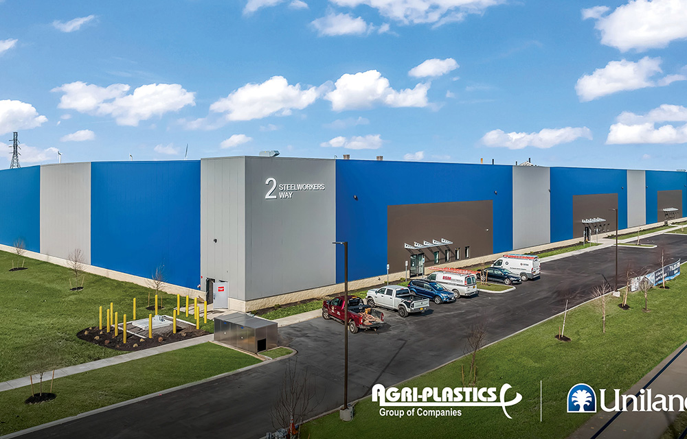
Hanna Commercial Real Estate brokers Agri-Plastics 64,000 s/f manufacturing facility lease at Uniland’s 2 Steelworkers Way
Lackawanna, NY Agri-Plastics, a global leader in the manufacturing of plastic products for agricultural, industrial, recreational, environmental, and home industries, has signed a 64,000 s/f lease to open a

Columns and Thought Leadership

Behind the post: Why reels, stories, and shorts work for CRE (and how to use them) - by Kimberly Zar Bloorian
Let’s be real: if you’re still only posting photos of properties, you’re missing out. Reels, Stories, and Shorts are where attention lives, and in commercial real estate, attention is currency.

AI comes to public relations, but be cautious, experts say - by Harry Zlokower
Last month Bisnow scheduled the New York AI & Technology cocktail event on commercial real estate, moderated by Tal Kerret, president, Silverstein Properties, and including tech officers from Rudin Management, Silverstein Properties, structural engineering company Thornton Tomasetti and the founder of Overlay Capital Build,

Lasting effects of eminent domain on commercial development - by Sebastian Jablonski
The state has the authority to seize all or part of privately owned commercial real estate for public use by the power of eminent domain. Although the state is constitutionally required to provide just compensation to the property owner, it frequently fails to account

Strategic pause - by Shallini Mehra and Chirag Doshi
Many investors are in a period of strategic pause as New York City’s mayoral race approaches. A major inflection point came with the Democratic primary victory of Zohran Mamdani, a staunch tenant advocate, with a progressive housing platform which supports rent freezes for rent




.jpg)

.gif)