UP Studio designs co-location dermatology and dentistry services for Mudgil Practice in Hicksville
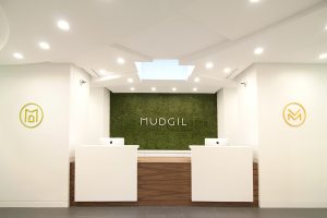 Hicksville, NY Now open for business, Mudgil Practices delivers dental and dermatology services from a shared office with a clean, minimal aesthetic. Designed by the UP Studio, the new office is unlike any other medical practice in the area.
The co-location of Mudgil Practices enables the doctors to significantly reduce their expenses by sharing key medical equipment, office equipment, and occasionally, even staff.
“There are very few medical practices like this in the country. We integrated our functional needs into the design to help create clarity and reduce the clutter of a busy office,” said Dr. Adarsh Vijay Mudgil, dermatologist. “The reactions from our patients have been remarkable. No one has seen an office like this in the area.”
Mudgil Practices came to UP with a challenging request: to design “the MoMA of doctor’s offices.” The husband and wife team of a dermatologist and dentist wanted to house their medical practices in a shared, but separate, office space with a contemporary aesthetic.
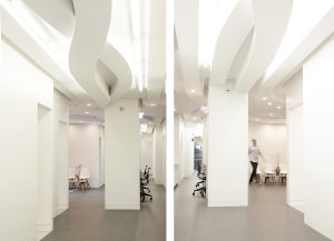 The resulting office includes a dermatology zone, a dentistry zone, mini and full-sized testing laboratories, shared and private offices for each practice, and an intimate shared waiting area for patients. The simple and clean aesthetic carries throughout the design, including the back-of-house lab and staff areas.
The doctors and UP evaluated several potential sites before settling on the space on Woodbury Rd. UP created feasibility studies, explored basic layouts, and compared rough construction costs of each potential site. The building that was ultimately purchased required a gut renovation to maximize efficiency of the plan.
Hicksville, an upwardly mobile, increasingly diverse hamlet in Nassau County, provides a substantial base of potential patients.
“The immediate area around the new office is industrial, and the practice itself stands out,” said Dr. Mudgil. “We’ve been getting a lot of foot traffic from new patients in the local neighborhood.”
“From a social perspective,” said Dr. Mudgil, “it has been really fun working together in the same space. It gives us some time together outside of the daily stresses. In the end it is much more relaxing to practice at the new office.”
Design Approach and Features
Through a multidisciplinary design process in which UP provided architecture, interior design, brand design, signage and wayfinding, custom topography, web design, and collateral coordination, UP presented a unified design that simplified every aspect of a patient’s experience in the space.
“Our studio is interested in the idea that multiple design disciplines can be integrated into a single architectural project,” said UP partner John Patrick Winberry. “Since our studio provides architecture, interior and brand design services, we have an unique opportunity to create fully integrated design concepts for our clients.”
The space’s main design feature is an extruded ceiling plane inspired by the circulation patterns throughout the office while simultaneously representing the unity of the two doctors within a shared space. UP’s primary goal was to eliminate the confusing circulation patterns commonly found in doctors offices and to create a simple plan which would help ease patients’ anxieties.
By distributing the required programmatic elements to the perimeter of the building, allowing as much natural light to enter those spaces, a central hall was created. While generating the two separate zones of the project, the central hall also provided clarity within the space and a sense of calm for the patients.
With clarity given to the plan, UP studied the circulation patterns of the patients, doctors, and staff, finding that there was a dynamic nature to their experience through the space. These circulation patterns were combined and then grafted to the ceiling plane creating a unifying gesture that unites both companies and the overall experience within the space.
Each practice utilizes state of the art equipment. The dermatology side is comprised of Boyd Industries surgical chairs, Medical Illuminations International surgical lights, CONMED Hyfrecators, and UVbioTek narrowband UV lamps. On the dental side, Henry Schein’s Dental team helped provide assistance in selecting the A-dec dental chairs, A-dec dental lights and monitors, A-dec 12 o’clock treatment dental cabinet, and the Planmeca ProMax 2D S3 Imaging Center, all of which complement the clean architecture.
The dermatology practice had been using an existing monogram created by OPTO design at their other locations. Using that single logomark as a foundation, UP created a monogram for the dentistry practice and an entire custom typeface that coincides with the existing mark. UP also created a shared identity that would identify the practices as a single entity. This mark was created to represent the two practices sitting side-by-side.
“Most of my competitors don’t have a brand identity or a strong architectural presence,” said Dr. Mudgil. “It is still relatively unique in medicine to present yourself as a brand. Working with UP, our original identity has become more developed and integrated into the new office.”
By designing all elements—architecture, interior, and brand design—simultaneously, UP created a visual language that is consistent throughout the project.
“With Mudgil Practices, our entire team was able to collaborate on every aspect of the project,” said UP partner John Winberry. “Having a client instill this level of trust in us was unbelievably rewarding.”
Suffolk County IDA supports expansion of A&Z Pharmaceuticals


The evolving relationship of environmental consultants and the lending community - by Chuck Merritt
When Environmental Site Assessments (ESA) were first part of commercial real estate risk management, it was the lenders driving this requirement. When a borrower wanted a loan on a property, banks would utilize a list of “Approved Consultants” to order the report on both refinances and purchases.




.jpg)