Ted Moudis Associates’ Foot Locker project honored by CoreNet NYC
Shown (from left) are: Richard Bliss, Cai Eberhardt of Foot Locker and Neil Pappone, Gene Manez of Ted Moudis Associates.
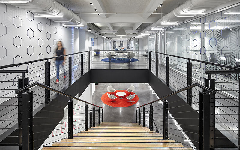
Manhattan, NY Ted Moudis Associates (TMA), an architectural and interior design firm, has been recognized by CoreNet Global NYC chapter for its design of Foot Locker’s new headquarters. The project was awarded the 2017 Commercial Interior Project of the Year over 75,000 s/f. The award was presented at CoreNet NYC’s Annual Meeting & Volunteer Appreciation Reception on June 21st. Foot Locker enlisted TMA’s services to design a new 145,000 s/f space over three floors at 330 West 34th St. that reflected its brand, creativity and corporate culture.
“We are thrilled that CoreNet has chosen to present our design for Foot Locker with this prestigious award,” said Ted Moudis, founder and senior principal of TMA. “It is a reflection of our dedicated team of designers, technical staff and workplace specialists who spend countless hours fine tuning the smallest details so we can provide our clients with best-in-class work environments that reflect their unique needs.”
“Foot Locker was an incredibly large and complex project that required the vision of the TMA and Foot Locker teams working together,” said TMA’s Richard Bliss, who served as the design director.
“Foot Locker was looking for a bright, interactive, textural space that would be comfortable for all of their corporate and retail division departments, promote staff collaboration and reflect the energetic quality of their staff and client base. We created a unique design that seamlessly combines an urban loft aesthetic with casual and playful features. The overall design elements were selected to be classic, textural and in no way clinical, providing an environment that will stay current for years to come. We are delighted that CoreNet chose to recognize our tireless work on this project and our unwavering attention to detail.”
Foot Locker features two main “promenades” of collaboration, which create a crisscross effect on the floors, and connect the north and south sides as well as the east and west sides of the space. This concept serves to break up a potential central core of offices and enclosed meeting rooms. In these main promenades, various types of open and closed meeting environments are provided, and Foot Locker’s products are displayed through the use of environmental branding and product showcases. The company wanted to ensure that all of its brands, not just Foot Locker, were represented in the space, and the TMA design team was very sensitive to this request.
The open work area is located along perimeter windows, providing an abundance of natural daylight. Benching workstations were chosen to make more efficient use of square footage and to promote easier communication between team members. Brand colors – red, green and blue - were used to differentiate the floors, but in general, the design aesthetic encouraged a seamlessness between them. A main café centrally located on the middle floor sits adjacent to a beautifully appointed roof terrace that provides outdoor green space for all of the staff members.
“We really wanted to introduce a lot energy into the space,” said Neil Pappone, who served as team principal on the project. “Our main directive was to create a space that was open, bright and interactive, in keeping with the brand’s heritage and we are thrilled we succeeded.” Pappone said. “Foot Locker was a tremendous company to partner with and our creative mindsets were very similarly aligned.”
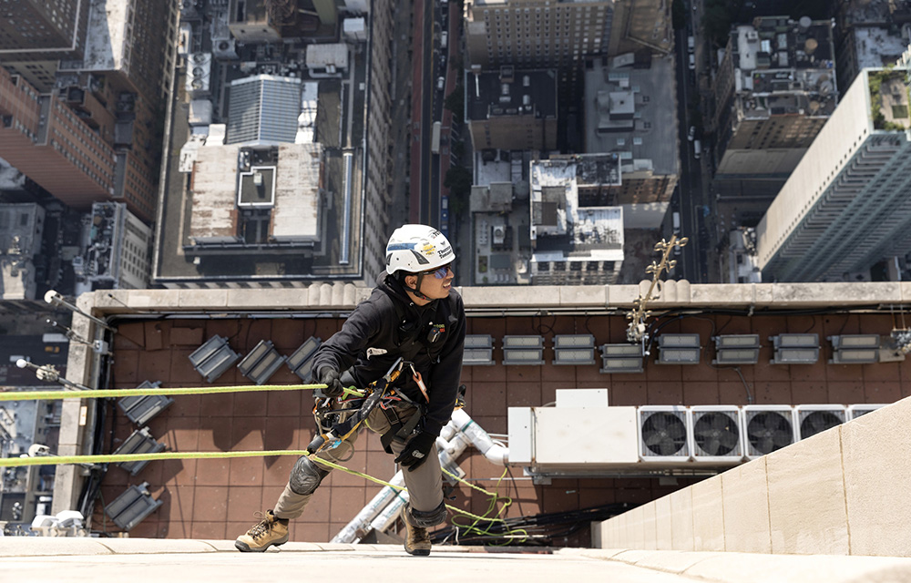
NYC mayor and DOB release comprehensive façade inspection and safety study conducted by Thornton Tomasetti



.gif)
.jpg)
.gif)
.gif)