Photo credit: Peter Dressel/Wilk Marketing Communications

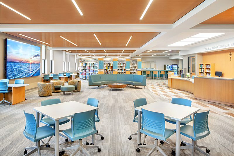
West Islip, NY BBS Architects, Landscape Architects and Engineers has completed the $2.08 million redesign and renovation of the 8,200 s/f St. John the Baptist Diocesan High School library at 1170 Montauk Hwy. BBS served as architect; interior and furniture designer; mechanical, electrical, and plumbing (MEP) engineer; and technology consultant. The scope of construction work included the full demolition and complete build-out of the library within this private Catholic school operated by the Roman Catholic Diocese of Rockville Centre.
“Our Msgr. Robert T. Mulligan Library had not been renovated or redesigned since the school was established in 1966. We wanted a modern library that would serve our students now and well into the future. We were looking for a multi-purpose venue that would provide an independent study environment, an informal social gathering setting, a meeting room, and a collaborative and flexible classroom and testing overflow space. The BBS design team has delivered a bright, welcoming, and functional library that fulfills all these needs,” said the school’s principal, Nan Doherty. “The school, parents, alumni and friends raised over $2 million for the renovation over three years,” she said.
The old library was outdated and no longer served the needs of the students. For example, prior to the renovation, the space was filled with book stacks, some of which were empty due to the digitization of part of the collection. School leadership retained BBS to develop an updated program and redesign the library, as BBS is known for its extensive experience in both schools and libraries.
“St. John School’s leaders and the architectural team consulted with students, faculty, and librarians in order to help define the optimal program. Primarily, all wanted to expand the library’s function as a place for students to both study and gather. It also needed to be highly flexible in order to accommodate a variety of meetings, classes, individual study, and group study, both large and small,” said BBS president and principal architect Roger Smith, AIA, LEED AP. “Students had noted that they enjoyed using the old space prior to the renovation, but that for after-hours studying they preferred going to the cafeteria so that they could access food and beverages. Thus, our designers made it a priority to include a corner with vending machines that would offer healthy snacks and drinks, and a high-end coffee maker.”
The project team also included the furniture contractor A.R. Kropp Co. and Sons, and the audiovisual consultant Applied Sound Corporation.
The design process was performed in phases, as the school had to raise funds from private sources and donors, which took several years to complete.
One early requirement was to create a section with multiple computer workstations for student research and work. However, as the design progressed, BBS realized that students were increasingly using their own electronics, so there was no need for such a general computer study area. According to Smith, “Instead, we proposed a dedicated room within the library for graphic design-related classes, pre-wired for a high number of high-end Macintosh computers, freeing space in the main reading room and allowing us much more freedom to create a strong and attractive design.”
Changing the organization of the space from one in which students would sit at stationary computer terminals to one in which they were bringing their own computers and tablets to be used at tables, counters, and lounge areas proved to be the right choice for St. John’s School and the latest trend in school and public library design nationwide and internationally.
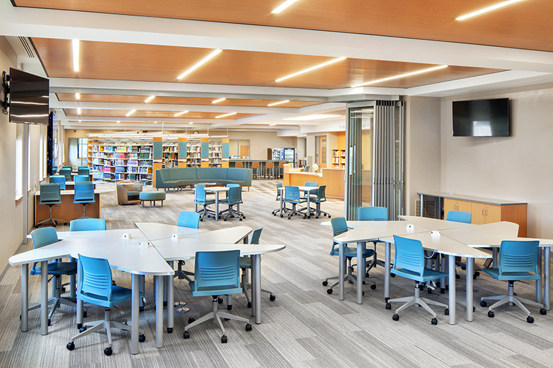
Within the main reading room, the design team reduced the number of book stacks for an abridged physical collection. The designers added the faculty conference room and the graphic design classroom near the stacks, located a multifunction room at the other end of the main reading room, and defined an easy circulation path throughout the space. The multifunction room is located behind a glazed movable wall by Nanawall that allows for physical and acoustical separation from the rest of the library when needed. Nanawall is a high-end product typically used in residential settings, but it works perfectly here, as it moves easily and does not require the usual floor rail. Instead, Nanawall requires only small lock pin nests; these are easier to install and are less visually obtrusive.
A second, smaller reading room, by the main library entrance, features reading tables and chairs, a 3-D printing station, and a study counter with high-backed stools along a glazed storefront-type internal wall separating the library from the hallway. At the far end of the second reading room is the school archive storage and study room, separated by a glazed wall and entrance.
A new conference room that can accommodate up to 16 people has a board room–style table. The graphic design classroom houses more than 30 Apple workstations.
The main library space features an oversized, nine-screen video wall for which content can be wirelessly controlled by librarians or students. BBS increased the amount of power going into the library to accommodate the new audiovisual/data connections and the high number of charging stations and power outlets installed throughout. The entire library is equipped with a robust Wi-Fi network.
Several walls throughout the space feature writable Sherwin-Williams wall paint in areas used for group study and presentations, including in the graphic design classroom and the second reading and study room.
The Main Reading Room and Custom Furniture
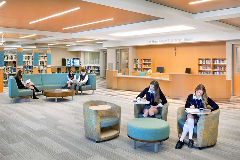
“The main reading room has a centrally located reference desk and checkout counter; book stacks; a food-service section with two vending machines and a coffee maker; and a flexible study area with an oversized sofa, lounge chairs, ottomans, and a variety of tables, including formal study tables, lounge tables, and others that can be easily configured without the need for heavy lifting,” said BBS project manager Gary Schiede, AIA. The food and beverage area also has an oversized semi-circular sofa with a low coffee table. Adjacent to the food area and within the main room is a small periodicals section. Book stacks now only occupy approximately 40% of the main reading room. The employee conference room is located at the east end of the main reading room. The multifunction room occupies the space at the west end of the main room and is equipped with printers for library users and two wall-mounted display screens.
BBS’s interior designer and furniture designer, Tracy Hansen, AIA designed much of the furniture based on a system by Palmieri. “We created wheelbarrow-style tables of various heights and shapes. Each has two wheeled legs, so the table can be tipped onto its wheels and easily moved to another location or reconfigured into a larger table for bigger groups of students,” said Hansen. She and her team also designed a rosette-style desk system for the multi-function room. The individual desks are a curved triangle shape and can be used individually or assembled together into larger, composite tables that resemble a flower, with separate workspaces between each pair of “petals” in the rosette. These tables all have outlets in them so that students can recharge their electronic equipment.
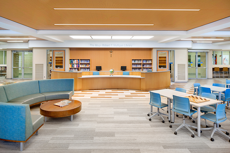
The custom curved reference and circulation desk was fabricated by Palmieri. It is centrally located, allowing librarians a line of sight into all library spaces. It seats up to four librarians at a time. Along the wall behind the circulation desk are storage cabinets with a countertop for computer equipment and displays of artwork. The reference desk’s curved shape easily accommodates traffic around it. The height was designed to allow for students to pull up chairs to have longer consultations with the librarians.
To highlight the circulation desk as the focal point of the library, BBS angled the position of book stacks to point at the desk. To further accentuate the circulation desk, the team added a faux skylight fixture above it. This bright LED fixture also increases the amount of light in a space that receives limited natural light as the building’s windows are on the small side and some of them are blocked by the stacks. Two smaller spaces flank the circulation desk: a librarians’ office is on one side and an IT room with servers is on the other.
The overall design of the library is quite modern, with contemporary materials and patterns throughout. However, in appreciation for traditional wood finishes in many libraries, the designers specified Armstrong Woodworks acoustical wood ceiling panels throughout the main space. The panels feature slots and perforations for acoustical mitigation purposes.
Carpet tile was used throughout the library. It has a linear pattern that enhances the pattern of the ceiling and lighting. Aside from the faux skylight, the ceiling lighting is relatively simple. Streamlined linear LED strips were selected so as not to visually compete with the wooden ceiling panels. All lights are dimmable.
When specifying the soft furniture, BBS selected vinyl upholstery to enable easy cleanup since food is now allowed in the library. The team selected two oversized semi-circular sofas as main furniture pieces that allow for interactions among groups of students. One is in the food area and the other is in the main study area in front of the circulation desk. Linoleum modular flooring by Forbo was used to create the circulation path leading around the reference desk and towards the exit. Signage is by 3 Form.
